What seasonal color analysis is
Seasonal color analysis is a styling system that groups colors by how they relate to a person's natural coloring: skin, hair and eyes. It became popular in the 1980s and is still widely used by stylists and image consultants. The four basic seasons are Spring, Summer, Autumn and Winter; most current systems split each into three, which gives twelve.
It is worth being clear about what it is. It is a practical framework, not a science, and different analysts draw the borders between seasons differently and use different names (a True Autumn in one system is a Warm Autumn in another). Treat a season as a useful shortlist of colors, not as a rule about what you are allowed to wear.
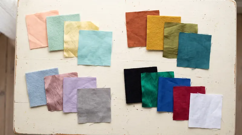
The three qualities behind the seasons
Each season is a combination of three qualities of color:
| Quality | Question it asks | Ends of the scale |
|---|---|---|
| Undertone (hue) | Does the color lean yellow or blue? | Warm or cool |
| Value | How light or dark is it? | Light or deep |
| Chroma | How saturated is it? | Clear (bright) or soft (muted) |
In broad strokes: Spring is warm and clear, Summer is cool and soft, Autumn is warm and soft or deep, and Winter is cool and clear or deep. Each sub-season is named after its strongest quality. A Light Spring is light first and warm second; a Deep Autumn is deep first and warm second.
The 12 seasons, with wardrobe neutrals
Below are the neutrals and colors the builder uses for each season preset. They are a selection from the builder's library of named colors, chosen to fit the usual description of each season. Analysts' palettes are larger and vary between systems. Open any season in the builder to shuffle palettes that stay inside it.
Light Spring
Light and warm. Delicate, sunny colors with no heavy darks.
Neutrals
- Camel
- Warm grey
- Soft navy
- Taupe
- Ivory
- Cream
- Ecru
Colors
- Peach
- Apricot
- Butter yellow
- Aqua
- Mint
- Coral
- Pistachio
- Blush
- Turquoise
- Cornflower
Warm Spring
Warm and fairly clear. Golden, fresh colors.
Neutrals
- Camel
- Cognac
- Soft navy
- Chocolate
- Khaki
- Ivory
- Cream
- Ecru
Colors
- Coral
- Tomato red
- Marigold
- Apricot
- Turquoise
- Kelly green
- Aqua
- Butter yellow
- Peach
- Tangerine
Bright Spring
Clear and warm-leaning. Saturated colors with crisp white.
Neutrals
- Navy
- Charcoal
- Camel
- Optic white
- Soft white
- Ivory
Colors
- Tomato red
- Coral
- Turquoise
- Kelly green
- Fuchsia
- Cobalt
- Lemon
- Tangerine
- Aqua
- Emerald
Light Summer
Light and cool. Pastels and soft greys. Not available in the builder for this season: Neutral + pop, Tonal.
Neutrals
- Slate
- Soft navy
- Taupe
- Soft white
- Dove grey
- Optic white
Colors
- Powder blue
- Lavender
- Blush
- Mint
- Periwinkle
- Dusty rose
- Cornflower
- Lilac
- Ice blue
- Aqua
Cool Summer
Cool and medium. Blue-based colors, softened.
Neutrals
- Navy
- Slate
- Charcoal
- Soft navy
- Soft white
- Dove grey
- Optic white
Colors
- Denim blue
- Dusty rose
- Raspberry
- Periwinkle
- Mauve
- Powder blue
- Lavender
- Cornflower
- Plum
- Teal
Soft Summer
Muted and cool. Dusty, grey-tinged colors. Not available in the builder for this season: Neutral + pop.
Neutrals
- Charcoal
- Taupe
- Slate
- Soft navy
- Soft white
- Dove grey
- Stone
Colors
- Sage
- Mauve
- Dusty rose
- Denim blue
- Petrol blue
- Lilac
- Powder blue
- Plum
- Blush
- Teal
Soft Autumn
Muted and warm. Gentle earth tones.
Neutrals
- Taupe
- Khaki
- Cocoa
- Olive
- Warm grey
- Oatmeal
- Stone
- Ecru
Colors
- Sage
- Terracotta
- Dusty rose
- Moss
- Mustard
- Petrol blue
- Peach
- Teal
- Apricot
- Cognac
Warm Autumn
Warm and rich. Spice and forest colors.
Neutrals
- Chocolate
- Olive
- Camel
- Espresso
- Cream
- Oatmeal
- Ecru
Colors
- Rust
- Mustard
- Moss
- Terracotta
- Forest green
- Teal
- Brick
- Marigold
- Cognac
- Petrol blue
Deep Autumn
Deep and warm. Dark, saturated earth tones.
Neutrals
- Espresso
- Chocolate
- Olive
- Black
- Cream
- Ecru
Colors
- Burgundy
- Forest green
- Teal
- Rust
- Brick
- Mustard
- Petrol blue
- Plum
- Bottle green
- Terracotta
Deep Winter
Deep and cool. Dark jewel tones with stark white.
Neutrals
- Black
- Charcoal
- Navy
- Espresso
- Optic white
- Soft white
Colors
- Burgundy
- Wine
- Bottle green
- Emerald
- Cobalt
- True red
- Aubergine
- Plum
- Icy pink
- Ice blue
Cool Winter
Cool and clear. Icy and blue-red colors.
Neutrals
- Black
- Charcoal
- Navy
- Optic white
- Dove grey
- Soft white
Colors
- True red
- Raspberry
- Cobalt
- Emerald
- Fuchsia
- Violet
- Icy pink
- Ice blue
- Wine
- Periwinkle
Bright Winter
Clear and cool. The most saturated colors with black and white. Not available in the builder for this season: Tonal.
Neutrals
- Black
- Navy
- Charcoal
- Optic white
- Soft white
Colors
- Fuchsia
- Cobalt
- Emerald
- True red
- Violet
- Turquoise
- Lemon
- Icy pink
- Raspberry
From a season to a wardrobe
A season palette usually comes as a fan of 30 to 60 swatches. That is a range to choose from, not a shopping list. To turn it into a wardrobe, apply the same structure as any wardrobe color palette:
- Pick the season's darkest neutral you like as your base: coat, trousers, shoes.
- Pick one of its light neutrals for shirts and tees.
- Choose one main color from the palette.
- Add one or two accents in small pieces.
The builder's season presets do this for you: choose a season and every shuffle stays inside it. Not every harmony mode exists in every season. A Light Summer palette has no truly bright colors, so the Neutral + pop mode is switched off for it, and some seasons don't have enough shades of one color family for a tonal palette with two accents. The builder tells you when that happens instead of quietly breaking the season.
Finding your season
The traditional method is draping: an analyst holds fabric in different colors under your face in daylight and compares how your skin looks. If you want to try something similar at home:
- Use daylight from a window, no makeup, and hair pulled back or covered with a neutral towel.
- Compare pairs of tops or fabrics near your face: optic white against cream, black against chocolate brown, a clear bright color against a dusty version of it.
- Look at your skin, not the fabric. Colors that suit you tend to make skin look even and clear; colors that don't can make shadows and redness more visible.
Common shortcuts like the vein test or the gold-versus-silver jewelry test are popular but are often described by analysts as unreliable on their own. A few honest comparisons in good light tend to tell you more.
A photo of yourself in a color is another useful check, because you see the color the way other people see it. FitInView's try-on puts a garment onto your own photo, which is a quick way to compare two colorways of the same piece before you buy.
See the colors on you, not on a hanger
Upload a photo of yourself and a photo or shop link of a garment; FitInView shows you wearing it.
Your first try-on is included with a free account. No card needed. Your photos are private to your account.
Questions
- Can I wear colors outside my season?
- Yes. A common approach is to keep colors outside your season away from your face, in trousers, skirts, shoes or bags.
- What if I fall between two seasons?
- That is common, and the twelve-season system exists partly for this reason. Neighboring seasons share colors; pick from the overlap, and use the builder presets of both to compare.
- Does hair color change my season?
- In most systems your season is based on your natural coloring, but a big hair color change can shift which colors look best near your face. Many people adjust their light neutral and accents rather than their whole palette.