What counts as a neutral in clothing
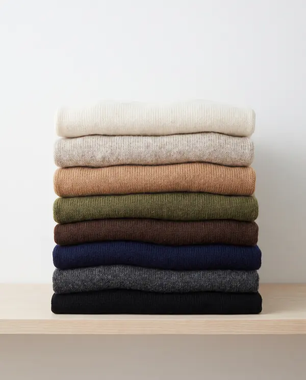
In clothing, a neutral is any color that goes with most other colors without competing with them. That includes the obvious ones (black, white, grey, beige) and a few that are technically colors but behave like neutrals: navy, brown, camel, olive and mid-blue denim.
What makes them neutral is mostly low saturation. Navy is a blue, but it is so dark and muted that it pairs with nearly everything. The same blue at full brightness would be a main color.
Warm and cool neutrals
Neutrals have undertones. Some lean yellow or red (warm), some lean blue (cool), and some sit in between. This matters most when two neutrals sit next to each other in an outfit.
| Cool-leaning | In between | Warm-leaning |
|---|---|---|
| Black (slightly), charcoal, navy, slate, dove grey, optic white | Taupe, ivory, soft white, mid-blue denim | Espresso, chocolate, cocoa, camel, khaki, olive, stone, oatmeal, ecru, cream |
Pairing neutrals of the same temperature is the low-risk choice. Mixing temperatures can look great, but it works best when the contrast in depth is big, like navy with cream.
Choosing the base neutral
The base neutral goes on your coat, trousers, shoes and everyday bag. Since you will buy these less often and wear them more, it is worth getting right. A practical shortcut: choose the neutral your shoes and outerwear already come in.
| Base | Character | Pairs easily with | Watch for |
|---|---|---|---|
| Black | Sharp, formal, high contrast | Optic white, ivory, clear brights like true red, cobalt, emerald | Can look harsh next to soft, muted colors |
| Navy | Classic, a little softer than black | Cream, ivory, camel, rust, mustard, red, pink | Next to black it can read as a near-miss |
| Charcoal | Quiet, modern | Soft white, dove grey, raspberry, teal, lilac | Can go flat with other mid greys |
| Espresso or chocolate | Warm, relaxed | Cream, ecru, rust, teal, forest green, mustard | Looks off next to cool blue-greys |
| Olive | Earthy, casual | Ecru, cream, rust, burgundy, petrol blue | Too many other earthy mid-tones turn muddy |
| Camel or taupe | Soft, light base | Optic white, cream, navy as an extra neutral, teal, burgundy | Needs a clearly light partner to avoid a washed-out look |
Choosing the light neutral
The light neutral covers shirts, tees, light knitwear and some summer bottoms. It also sits closest to your face, so it is worth trying a few options in daylight.
- Optic white is crisp and cool. It suits high-contrast palettes with black, navy or charcoal.
- Soft white and ivory are slightly softer. They work with almost every base neutral and are a safe default.
- Cream and ecru are warmer and pair naturally with browns, olive, camel and navy.
- Stone and oatmeal are deeper beiges. They need a dark base for contrast: espresso, chocolate, olive or navy.
- Dove grey is a cool light neutral that suits charcoal, navy and slate.
Whatever you choose, the light neutral should be clearly lighter than the base. In the builder, the two neutrals must differ in depth by a set amount, so it won't suggest a pair like khaki and dove grey that would blur together.
Pairs that work, pairs to watch
These neutral pairs tend to look deliberate:
These are worth a second look before you commit:
- Warm brown with cool grey (chocolate with dove grey, for example). The undertones pull in different directions. The builder never pairs them.
- Black with navy in the same outfit. It can be done on purpose, but in a palette it usually makes sense to choose one as the base.
- Slate with yellowish beige such as oatmeal. Two muted colors with opposite undertones tend to look tired together.
- Two mid-tones. Taupe with khaki, or camel with stone: not enough contrast to read as a pair.
Do you need a third neutral?
Many wardrobes have one: a camel coat with a navy and cream wardrobe, or grey knitwear next to black and white. That is fine. If a third neutral covers a lot of your pieces, it is effectively your main color. The builder's Neutral + pop mode works on the same idea: a quiet main color, such as sage, powder blue or dusty rose, with one clearly brighter accent.
What a third neutral should not do is replace your accent. If everything is neutral, outfits can feel flat. Texture helps here: a wool coat, a ribbed knit and a crisp cotton shirt in the same two neutrals look richer than three flat cottons. For the color side, see accent colors.
See the colors on you, not on a hanger
Upload a photo of yourself and a photo or shop link of a garment; FitInView shows you wearing it.
Your first try-on is included with a free account. No card needed. Your photos are private to your account.
Questions
- Is navy or black more versatile?
- Both are versatile. Navy tends to pair more easily with warm colors and with browns; black tends to suit clear, high-contrast palettes. Look at what your shoes and coat already are.
- Can I wear brown and black together?
- Yes, when the brown is clearly different from black, such as camel or cognac. Very dark brown next to black can look like a mismatch.
- What is the most universal light neutral?
- Soft white or ivory. They sit between crisp optic white and warm cream, so they go with both warm and cool base neutrals.