Why a palette helps
A wardrobe color palette is a short list of colors that you buy clothes in on purpose. It is not a uniform. The point is practical: when most pieces share a small set of colors, most tops go with most bottoms, getting dressed takes less thought, and the things you buy keep working with the things you own.
The usual structure, and the one the palette builder uses, has four or five colors with different jobs:
- A base neutral, dark or mid-tone, for the pieces you wear the most: coat, trousers, shoes, bag.
- A light neutral for shirts, tees and the pieces that sit next to your face.
- One main color, the color that gives the wardrobe its character.
- One or two accents, used in small doses.
Neutrals carry most of the wardrobe. That is the part people tend to skip, and it is why a closet full of colors they love can still feel like it has nothing to wear.
The six steps
1. Take stock of what you actually wear
Pull out the 15 to 20 pieces you have worn most over the last few months. Not the ones you like most in theory: the ones you reach for. Sort them into piles by color.
In most closets two or three colors dominate those piles. Those are your real palette, and they are the best starting point because they are proven: you already own shoes, bags and layers that go with them. While you are at it, look at the pieces you own but never wear. Color is often the reason. A top that goes with nothing else you own stays on the hanger, however good it looked in the shop.
2. Choose your base neutral
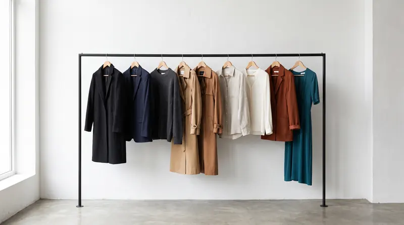
The base neutral is the dark or mid-tone color for the pieces you wear constantly and tend to spend more on: outerwear, trousers, shoes, a bag. The usual candidates are black, navy, charcoal, a dark brown such as espresso or chocolate, and olive. Lighter options like camel or taupe work too if your style is softer.
The quickest way to choose: look at your shoes and your coat. If they are mostly black, black is probably your base. If they are brown, a brown or olive base will save you from buying a second set. The guide to neutral colors compares the options side by side.
3. Choose the light neutral
The light neutral covers shirts, tees, light knitwear and summer trousers. Optic white, ivory, cream, ecru, stone and light grey are the common choices. Hold a piece in your base neutral against a piece in the light neutral. They should look like a deliberate pair.
As a rule of thumb, warm neutrals sit well with warm neutrals (espresso with cream, olive with ecru) and cool ones with cool ones (charcoal with soft white). Some cross pairs are classics anyway: navy with cream, black with ivory. Pairs that tend to look off are warm browns next to a cool blue-grey, and slate next to yellowish beige.
4. Pick one main color
The main color is the one you buy knitwear, a skirt, a dress or a jacket in. It is often already visible in your piles from step 1: the color people compliment, or the one you keep buying without thinking about it.
Test it against both neutrals. Lay a main-color piece on top of a base-neutral piece, then on top of a light-neutral piece. If it works with both, it earns its place. If it only works with one, every outfit with the other neutral becomes a problem.
One main color is enough. Two main colors of similar strength compete, and you end up needing a separate set of neutrals and accents for each.
5. Add one or two accents
Accents are the colors you see in small amounts: a bag, a scarf, one shirt, a print, socks. Because they are small, they can be livelier than the main color. There are four common ways to choose them, and the builder has a mode for each:
- Tonal: a lighter or deeper shade of the main color. Calm and polished.
- Analogous: a color next to the main color on the color wheel, such as rust next to mustard. Easy to wear.
- Complementary: a color roughly opposite the main color, such as teal against rust. Lively, so keep it small.
- Neutral + pop: a quiet main color and one bright accent. Minimal wardrobes often work this way.
The guide to accent colors goes into how much accent an outfit can take and where to put it.
6. Write down the split and shop against it
A palette is only useful if it changes what you buy. Write the colors down with a rough share for each. The builder uses this split as a rule of thumb:
| Role | Share of the wardrobe | Typical pieces |
|---|---|---|
| Base neutral | about 35% | Coat, trousers, shoes, bag, blazer |
| Light neutral | about 25 to 30% | Shirts, tees, light knits, summer trousers |
| Main color | about 20 to 25% | Knitwear, a skirt, a dress, a jacket |
| Accents | about 10 to 15% in total | Bag, scarf, one top, prints, socks |
Before you buy something new, ask two questions. Which role does it fill? And does it go with at least three things you already own? If a piece fills no role, it can still be worth buying, but you will know you are buying an exception.
Common mistakes
- Too many main colors. Five favorite colors at equal strength is a collection, not a palette. Pick one main color and let the others become accents or go.
- Neutrals with clashing undertones. A chocolate coat over cool grey trousers can look like two outfits. Check the pair from step 3 in daylight.
- Accents in large pieces. An accent color as a full coat stops being an accent. It becomes your main color, and the rest of the palette has to follow.
- Everything mid-tone. If every color sits at the same depth (khaki, sage, mustard, taupe), outfits tend to look muddy. A palette needs a clearly dark color and a clearly light one. The builder refuses palettes without that range.
- Choosing from a trend list. A palette built on this season's colors will look dated before the clothes wear out. Start from step 1.
Check it in the builder, then on yourself
Open the palette builder, use Pick to set the colors you identified in steps 1 to 3, and lock them. Then shuffle. The builder fills the remaining slots with colors that fit the harmony mode you choose, and shows the result on a set of garments so you can judge proportions, not just swatches.
A color can look right on a swatch and different next to your skin and hair. That is the part a swatch cannot tell you. Trying a garment on your own photo before you buy it closes that gap.
See the colors on you, not on a hanger
Upload a photo of yourself and a photo or shop link of a garment; FitInView shows you wearing it.
Your first try-on is included with a free account. No card needed. Your photos are private to your account.
Questions
- How many colors should a wardrobe palette have?
- Four or five is a common working number: two neutrals, one main color and one or two accents. Fewer can feel restrictive; many more and the pieces stop combining easily.
- Can black and navy be in the same palette?
- Yes, but usually not side by side in the same outfit unless it is clearly deliberate, because the two can read as a near-match. Many people pick one as the base neutral and use the other rarely.
- Do I need a seasonal color analysis first?
- No. Your most-worn clothes already tell you a lot. If you have had an analysis, the builder's season presets limit shuffling to colors from your season. See the guide to seasonal color palettes.
- What if my favorite color does not fit?
- Make it the main color and rebuild the neutrals and accents around it, or wear it as an accent near your face. A palette should serve the colors you love, not exclude them.