Wardrobe color palette generator
Build a wardrobe palette from named clothing colors: two neutrals, a main color and one or two accents. Pick and lock the colors you own, shuffle the rest, see how they work together on eight garments, and save a PNG.
On a keyboard, press Space to shuffle.
How to read this palette
Navy and Ivory carry about 65% of the wardrobe: coats, trousers, shirts, shoes. Rust is the main color, the one you buy knitwear, a skirt or a jacket in. Teal sits roughly opposite rust on the color wheel, which is why a small dose is enough. Keep accents to small pieces: teal for a bag or scarf, mustard for one top or a print.
The palette, on eight pieces
Swatches hide proportion. Here the base neutral goes on the coat, trousers and loafers, the light neutral on the shirt and skirt, the main color on the knit and the accent on the bag. The T-shirt takes the second accent, or the light neutral when you choose one accent. Tap or select a piece to switch it to the next palette color.
The percentages are a rule of thumb for how much of a wardrobe each color covers, not a quota. Save PNG exports the palette strip and these eight pieces as one image.
Same three pieces, three palettes
One person and the same three shapes (a long coat, a crewneck knit, wide-leg trousers) in three color combinations. Only the colors change, and the look changes with them. Choose a combination to compare it with the others or with the original photo.
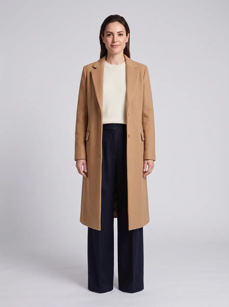
The neutrals set the overall feel: crisp with navy and ivory, soft with charcoal and dove gray, warm with espresso and cream. The strongest color decides what you notice first: the camel coat in the first look, the knit in the other two.
The woman and the clothes are AI-generated. Each look was made with FitInView's AI try-on from her original photo and three product photos.
Try your own palette on your own photo
A palette shows which colors work together. To see a color next to your own skin and hair, upload a photo of yourself and a photo or shop link of a garment. FitInView generates an image of you wearing it.
Your first try-on is included with a free account. No card needed. Your photos are private to your account.
How the generator picks colors
Unlike a general palette tool, this generator works with clothing colors only: a library of 66 named colors (13 base neutrals, 8 light neutrals and 45 colors), each with a hex value. Each shuffle is checked in the OKLCH color space against the harmony mode you choose and a set of rules written for outfits.
Tonal
The accents are lighter or deeper shades of the main color, within about 30 degrees of hue. Calm and polished, and hard to get wrong.
Charcoal, soft white, dusty rose, burgundy, mauve
Analogous
The accent sits next to the main color on the color wheel, 25 to 65 degrees away. The colors blend without looking matched.
Black, ecru, rust, mustard
Complementary accent
The accent sits roughly opposite the main color, at least 140 degrees away. It is lively, so keep it small. A second accent stays close to one of the two.
Navy, ivory, rust, teal, mustard
Neutral + pop
The main color is quiet: muted or very light. One accent is clearly more saturated than everything else.
Charcoal, soft white, sage, cobalt
- One neutral is clearly darker than the other, so outfits have contrast.
- The palette always runs from a clearly dark color to a clearly light one.
- No two colors are so close that they look like a mismatch.
- No more than two saturated colors, and two only when they sit roughly opposite each other or are almost the same hue.
- No near hues with opposite undertones, such as brick next to fuchsia.
- No more than one dull, earthy mid-tone among the main color and accents, which is what makes palettes look muddy.
- Warm neutrals (browns, camel, olive, khaki, warm gray) are never paired with cool dove gray. Slate is never paired with the yellowish beiges stone and oatmeal, and charcoal never with oatmeal.
Colors you set yourself with Pick stay as they are, even if they break a rule. The palette description then shows a heads-up.
If you have had a seasonal color analysis, choose your season in the Season preset menu and every shuffle stays inside it. The 12 presets are lists of colors, not an analysis of you. The seasonal color palettes guide lists the colors behind each preset. The same structure works for a capsule wardrobe, a work wardrobe or a single outfit color combination.
Guides
The reasoning behind the tool, written for people who are building or clearing out a wardrobe.
- How to build a color palette for your wardrobeA six-step method for building a wardrobe color palette from the clothes you already wear: base neutral, light neutral, main color, accents.
- Capsule wardrobe colorsHow many colors a capsule wardrobe needs, how to split them between neutrals, a main color and accents, and five capsule palettes that work.
- Neutral colors for your wardrobeWhich neutral colors to build a wardrobe on: black, navy, charcoal, brown or olive as a base, which light neutral to pair, and warm vs cool neutrals.
- Accent colors in outfitsHow to use accent colors in outfits: how much accent a look can take, where to place it, four ways to choose one, and accents for common neutrals.
- Seasonal color palettesThe 12 seasonal color palettes explained for clothing: what each season means, neutrals and colors for each, and how to turn a season into a wardrobe.