What an accent color does
An accent color is a color that appears in a small amount against a calmer background. In an outfit, it gives the eye somewhere to land. A grey coat, grey trousers and black boots read as practical; add a cobalt bag and the same outfit reads as a choice.
Because an accent is small, it can be louder than anything else you wear. That is the main difference between an accent and a main color: the main color is worn in large pieces and needs to be easy; the accent is worn in small pieces and can be bold.
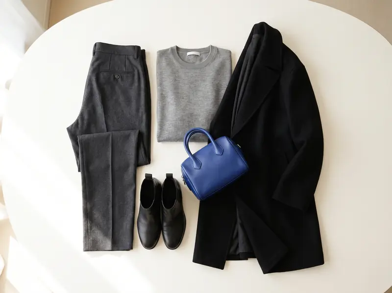
How much accent is enough
A rule of thumb borrowed from interior design is 60-30-10: about 60% of an outfit in a dominant color, 30% in a secondary color and 10% in an accent. In clothing terms, 10% is roughly a bag, a scarf, a belt or a pair of shoes.
The builder applies a similar idea to the whole wardrobe rather than a single outfit: accents get about 10 to 15% of the pieces in total. In practice:
- One accent piece per outfit is the easiest place to start.
- Two pieces in the same accent (a scarf and shoes, say) can work when they are far apart on the body, so the color repeats instead of clumping.
- A full garment in the accent color, like a coat or a dress, turns it into the main color of that outfit. That is not wrong, but the rest of the look then needs to step back.
Where to put an accent
Where the accent sits decides where people look first.
- Near the face: a scarf, a collar, earrings or a top under a jacket draw attention upward. This is where a color that suits your coloring pays off most.
- At the hand or hip: a bag, a belt or a watch strap. These are easy to change, so they are the lowest-risk way to try a new accent.
- At the feet: shoes or socks. A bright shoe with an otherwise neutral outfit is a classic move.
- In a print: a shirt or scarf that combines your main color and your accent ties the two together without needing to match exactly.
Four ways to choose an accent
An accent works when it has a clear relationship to the main color. These four relationships are the harmony modes in the palette builder.
Tonal
A lighter or deeper version of the main color. Burgundy with dusty rose, forest green with sage. The result is calm and polished, and it is the hardest mode to get wrong.
Analogous
A color next to the main color on the color wheel, typically 25 to 65 degrees away. Rust with mustard, cobalt with violet. The two blend without looking matched.
Complementary
A color roughly opposite the main color: rust and teal, cobalt and marigold, dusty rose and sage. Opposites make each other look stronger, which is why a small amount is enough.
Neutral + pop
A quiet main color, often close to a neutral, with one clearly brighter accent. This is the mode for minimal wardrobes and for people who mostly wear grey, camel or navy.
Accents for common neutrals
These pairings tend to work well. They are starting points, not rules: undertone and depth matter more than the name of the color.
| Base neutral | Accents that often work |
|---|---|
| Black | True red, cobalt, emerald, fuchsia, icy pink |
| Navy | Rust, mustard, tomato red, coral, pink, marigold |
| Charcoal | Raspberry, teal, lilac, cobalt, plum |
| Espresso or chocolate | Teal, terracotta, mustard, forest green, peach |
| Olive | Rust, burgundy, mustard, petrol blue |
| Camel | Burgundy, teal, cobalt, forest green |
Using two accents
Two accents can make a palette more flexible, but they need a pecking order. The builder handles this in two ways, and both work well for clothes:
- One loud, one quiet. A bright accent for bags and shoes, and a muted one for tops and prints. The builder never allows more than two saturated colors in a palette, and two saturated colors only as true opposites.
- Both from one family. A second accent that is close to the first or to the main color, so it reads as a variation rather than a new idea.
What tends to fail: two bright accents with near hues and opposite undertones, such as brick next to fuchsia, or coral next to raspberry. They sit close enough to look like a mistake. The builder filters those out.
To see how accents fit into the bigger structure, read capsule wardrobe colors.
See the colors on you, not on a hanger
Upload a photo of yourself and a photo or shop link of a garment; FitInView shows you wearing it.
Your first try-on is included with a free account. No card needed. Your photos are private to your account.
Questions
- Should my shoes and bag match?
- They do not need to. Repeating an accent color in two places, such as bag and shoes, looks deliberate; a bag and shoes in two different accents can look busy unless the rest is very quiet.
- Can an accent be a neutral?
- Yes. In an all-black outfit, a camel coat or a white shirt acts as the accent. Accent describes the role, not the color.
- How do I find accents that suit me?
- Try them near your face first, in daylight, against your light neutral. Colors that make your skin look clear and even tend to be good accent candidates.